What we created: We initially created a stamp style logo and separate mark to bring in the history of the post office, with a unique coffee cup icon and a clean typeface to keep it simple and appeal to their large customer target base. Having added the coffee shop to the business, we utilised their stamp for coffee cups, apron designs and swing tags for their post office products, as well as a professional email signature for communication. Their new branding works well to keep the essence of their historical background but attract some newer locals in for coffee as well!
Stamp & Grind Cafe Logo Design

Stamp & Grind Cafe Branding Design
|

Stamp & Grind Cafe Branding Design
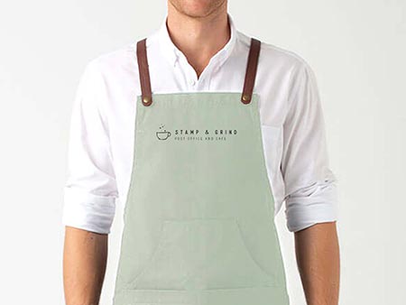
Stamp & Grind Cafe Graphic Design
|

Stamp & Grind Cafe Website Design

Stamp & Grind Cafe Graphic Art
|


.jpg)
.jpg)

.jpg)